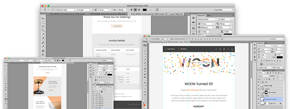
Project Case Study

Woon Furniture PSD to Email Conversion

A full set of 11 different email templates - transactional, newsletter, promotional. All of them optimized for mobile devices - responsive.

  • Responsive
  • Best Email Practices
  • Transactional Emails
  • Modern Design
  • Newsletter Email
Preparation

Design

The client provided us with a group of 12 PSD files: 11 PSDs for each of the email templates and one file containing a guideline for mobile devices optimization. We had to use it as a base for the responsiveness. We had to review them closely to make sure we were on the same page.

Design

Requirements

Since the client said that they had an expert on their team that could do the MailChimp / Mandrill integration, we only had to code the templates with a forthcoming MailChimp integration in mind.

As usual, all emails had to be responsive and we had to make sure all texts were live, i.e. editable.

They also asked us if we could help them code their website but that was a subject of another discussion.

Clearing up the details

Before proceeding, we wanted to clear up a few design issues we noticed. There were custom fonts used in the design, so we had to figure out whether we should use them, or use system fonts. The summary that we came up with was:

  • Responsive emails
  • No MailChimp integration
  • Custom fonts
  • Maximum compatibility
  • Only actual texts usage

And we started...

The project time frame was 2 business days.

Slicing
Step 1

Slicing

The designer of our client made our job significantly easier by following good design practices. Before slicing the images we went through all designs files to make sure everything was clear. After that the process went super smoothly.

Step 2

Coding

We followed the same pattern for the coding. Instead of jumping straight to the first email, we reviewed all design files, prepared all elements that were about to be used across the templates, and then we started the building phase.

Responsive version
Responsive version
Step 3

Responsive version

Since we had a mobile design to follow, we applied all media queries needed for the responsiveness. At the same time we had to make sure the templates passed all tests, so we had to adapt them based on the good practices. Then, we made tests on various mobile devices to ensure that everything looked good and attractive.

Fine tuning
Step 4

Fine tuning and QA

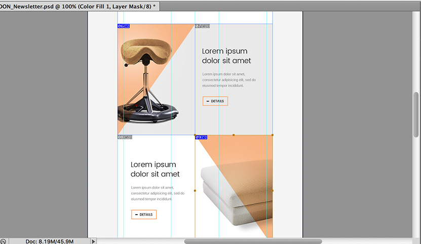
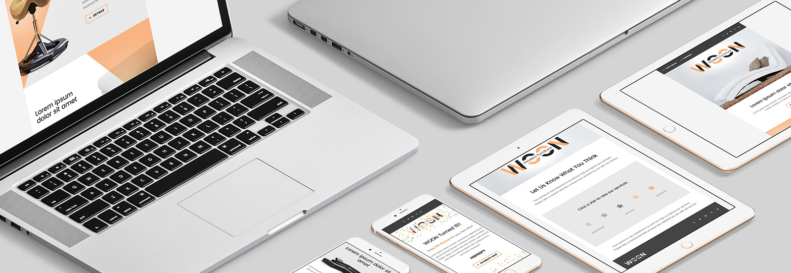
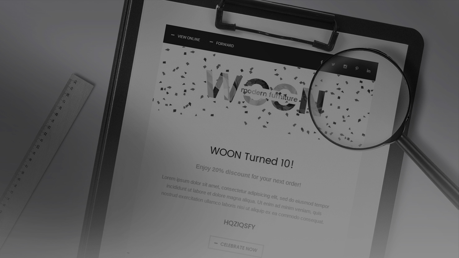
After a lot of testing on desktop and mobile devices, as well as on different email clients and email services, Della (QA) prepared a list of a few things that needed attention. We adjusted the templates as needed. Then we made one last check according to the designs to make sure everything was perfect.

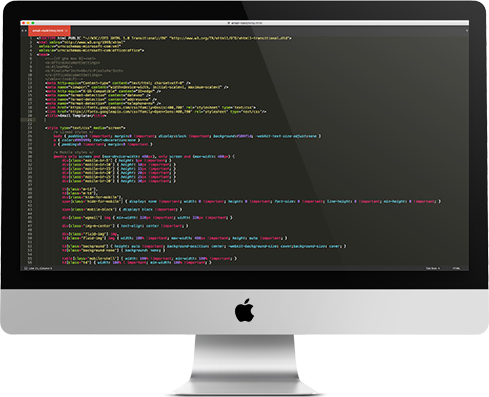
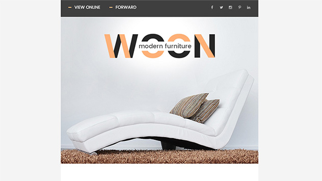
In the end there were a total of 11 responsive email templates which looked exactly like the designs. At the same time, they were created in compliance with the best practices.

Project preview
Voilà!

The project is ready!

Check out the video below the see the whole thing in action

Video cover
Delivery

All the hard work is done

That was another successful project for htmlBoutique and the client was very happy with it. A few days later, he came to us to let us know that the manager who worked with the final files was pleasantly surprised by the code.

Overall

Project Estimate

Price:
$784.00
Timeframe:
2 Business Days
Previous / Sweet Sensations

Coding of 3 email templates including responsive work and CampaignMonitor integration.

  • Responsive
  • CampaignMonitor Integration
  • Newsletter Coding
  • Products Listing
  • Video Email
Next / Design Conference

Design and coding of a single email template for a design conference, including responsive design and MailChimp Integration.

  • Design work
  • Responsive
  • Email Best Practices
  • MailChimp Integration
  • Modern Design
Project preview

This Is Our Web Let’s shape it together!

© htmlBoutique 2008-2024. All Rights Reserved